DOCTORHERE  /  PRODUCT DESIGN

OFFLINE CHECK-IN

Scroll Down

DoctorHere: Optimizing Offline Check-in Experience

DoctorHere, a US-based healthcare service, primarily focused on telemedicine. However, with the introduction of a hybrid care model, the influx of in-person consultations exposed inefficiencies in their paper-based check-in process. This project aimed to streamline the user experience and expedite insurance processing by integrating both in-person and remote consultation data into a unified electronic record system at the point of check-in.

TEAM

DoctorHere Design Team (3 members)

PRIMARY ROLE
Tablet UI/UX Design UI/UX Strategy Service Flow Optimization
Duration

2 months

Project Context

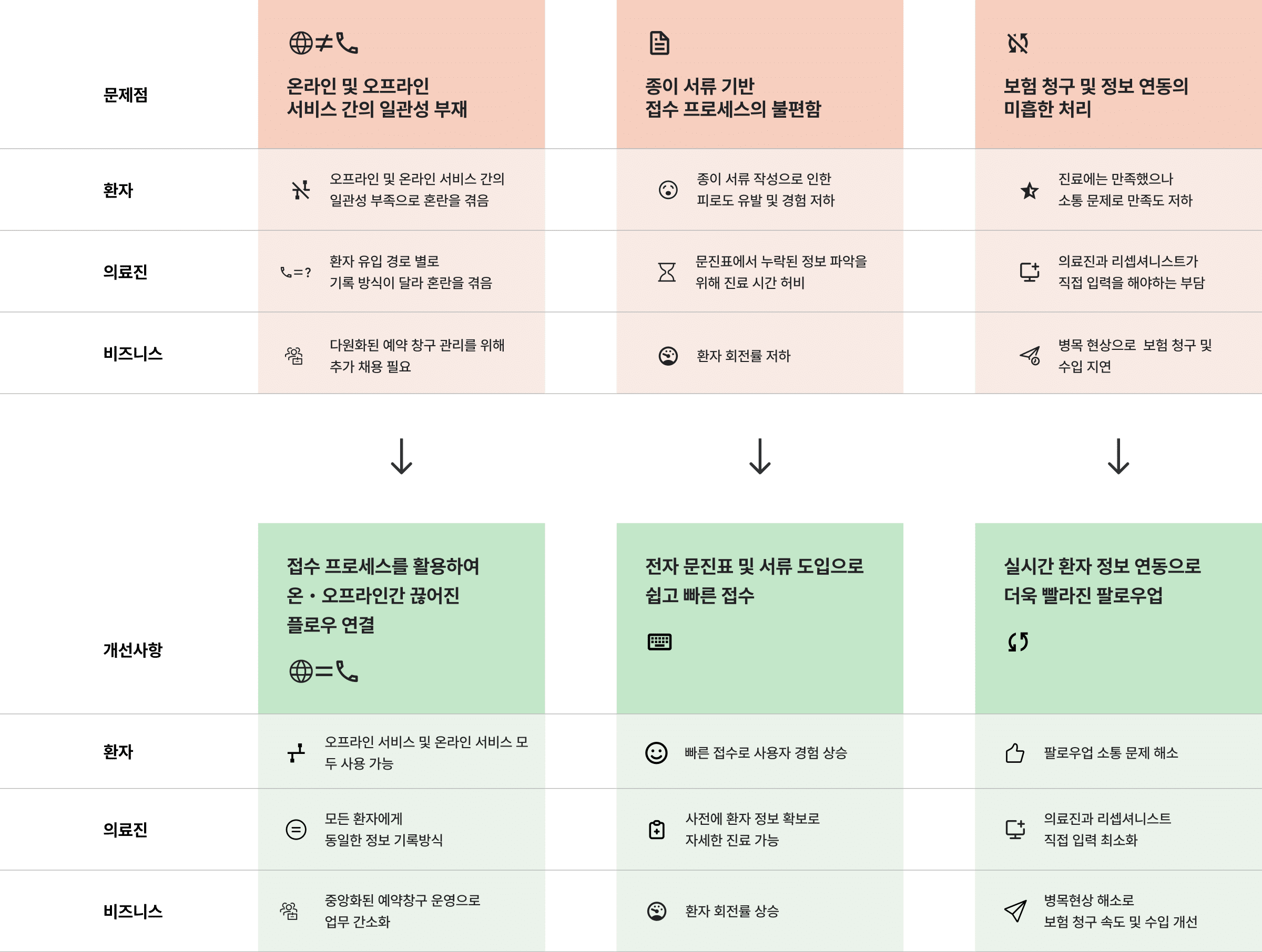
DoctorHere’s transition to a hybrid model and expansion of insurance coverage led to a tenfold increase in monthly patient visits within a single month. This sudden surge overwhelmed all departments, resulting in a cascade of issues affecting patient satisfaction, staff workload, and overall service quality.

DoctorHere In-person Visit Service Blueprint(as-is)
How Might We

How might we enhance focus on patient care for both patients and doctors?

Design Challenge

We identified three critical pain points impacting patients, medical staff, and business operations. Our approach prioritized solving the most pressing patient issues while maintaining service continuity and seeking rapid solutions.

Key Improvement 01

Seamless Integration of Online and Offline Services

  • Solution:
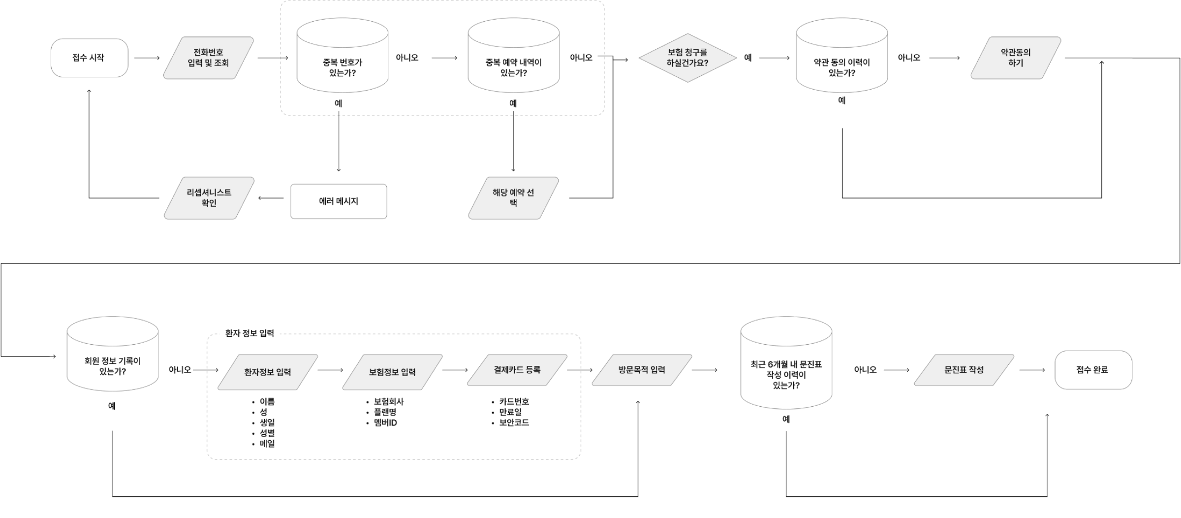
    • Implemented phone number-based patient lookup
  • Impact:
    • Patients gained access to online services
    • Medical staff utilized consistent recording methods across all patient types
    • Centralized reservation system streamlined operations

We also designed an error handling flow to manage edge cases, ensuring a smooth experience even when unexpected issues arose.

실제 플로우 작업 화면

Key Improvement 02

Digital Transformation of Check-in Process

  • Solution:
    • Introduced electronic questionnaires and document management
  • Impact:
    • Dramatically reduced manual data entry for patients
    • Shortened check-in times
      Allowed patients to focus on their visit purpose and medical history
    • Freed up 5-10 minutes per patient for medical staff to focus on consultations
These images showcase the previous paper-based check-in process at DoctorHere clinics. This system led to inefficiencies, longer wait times, and data inconsistencies, prompting our digital transformation initiative.
Digital check-in screens

Key Improvement 03

Real-time Synchronization for Efficient Follow-ups

  • Solution:
    • Implemented real-time data synchronization between systems
  • Impact:
    • Resolved inconsistencies between electronic records and offline services
    • Eliminated bottlenecks in prescription processing, test communication, and insurance claims
    • Enabled faster patient follow-ups
      Reduced insurance claim processing time by over 50%
    • Transformed month-long post-billing payment periods into real-time transactions
DoctorHere In-person Visit Service Blueprint(to-be)

Results and Impact

The optimized check-in process is now fully operational, delivering significant improvements:


    • Reduced pre-consultation waiting time up to 40%
    • Increased medical staff focus on patient care
    • Streamlined post-consultation processes
    • Expedited insurance claim handling
    • Improved overall patient and staff satisfaction
This project demonstrates how strategic UX improvements can transform healthcare delivery, enhancing both patient experience and operational efficiency.

Prototype

Click here to experience the interactive prototype.