RESPONSIVE WEB DESIGN

MOIN

Scroll Down

OVERVIEW

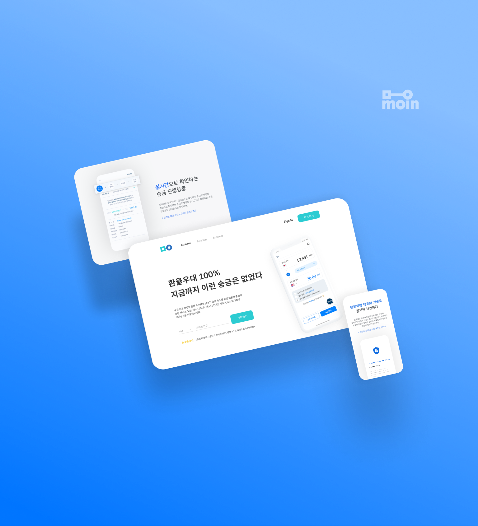
Moin is a financial technology startup trying to improve overseas remittance experience by “creating user-centered remittance services, not bank-centered.”

However, Moin’s landing page does not reflect the business motto and puts more emphasis on showcasing achievements rather than serving users’ needs.

The main goal of this project is to reflect Moin’s user-centered business motto on the landing page and convert visitors to customers.

TEAM
Individual project
PRIMARY ROLE
Responsive design, UI/UX Development
MAIN TOOLS
Figma, Illustrator, Photoshop
OBSERVATION

MOIN’S VALUE POSITION & THE USERS

The core value of overseas remittance FinTech startups is to provide faster, easier, cheaper, and more secure services than traditional banks.

According to the company description, the unique algorithm is the strength that Moin can differentiate itself from other overseas remittance FinTech startups. Also, Moin emphasizes offering user-centered services.

Judging from the menu composition, Moin mainly targets students and businesses sending money from South Korea to abroad. The service is also available to the rest of the general users.

FASTER

EASIER

CHEAPER

MORE
SECURE

+

USER-
CENTERED
FASTER
EASIER
CHEAPER
MORE
SECURE

+

USER-
CENTERED

CURRENT PAGE ANALYSIS

CURRENT PROBLEMS

A.

Unclear selling point

Hard for users to find Moin’s value on its landing page.

B.

Misleading CTAs

Takes time to identify where to start.

C.

Page not being responsive

Risky to trust a service that has an inadequate mobile landing page.

How Might We reflect Moin’s user-centered business motto on the landing page and convert visitors to customers?

SOLUTIONS

01

DELIVER A CLEAR MESSAGE
  • Make a strong first impression
  • Put one message on one screen
  • Keep a consistent visual style.

02

PROVIDE COMPELLING CTAs
  • Relevant to the viewer’s device
  • Repeat CTAs at the end of the page
  • Linked to the conversion goal

03

MAKE IT RESPONSIVE
  • On any device, every CTA
    is compatible and every element
    is designed to be legible, clickable
    and tappable.
  • Use the grid system

01

DELIVER A CLEAR MESSAGE

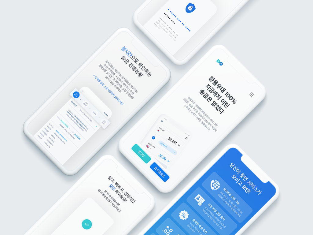
At a glance, it is hard for users to define Moin’s value because the current landing page does not provide a clear selling point. Also, it tries to serve multiple purposes on a landing page.

To deliver a clear message,

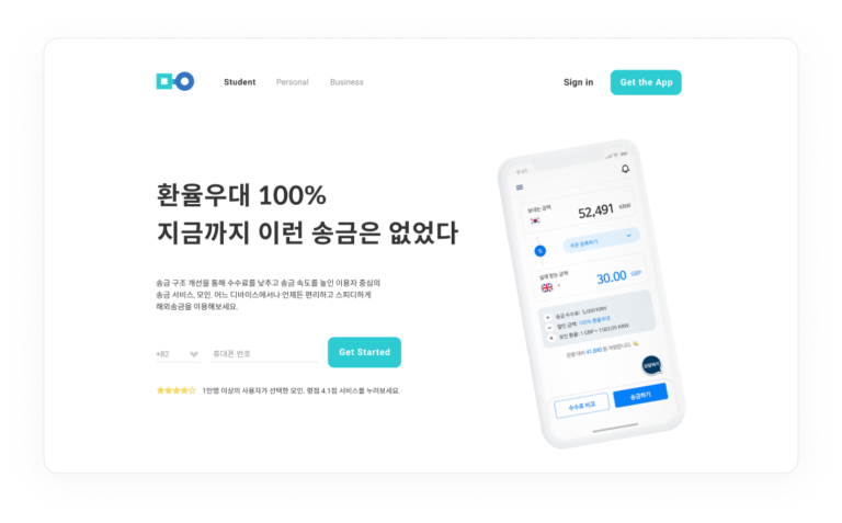
  • Make a strong first impression through a compelling hero shot and a Unique Selling Proposition (USP).
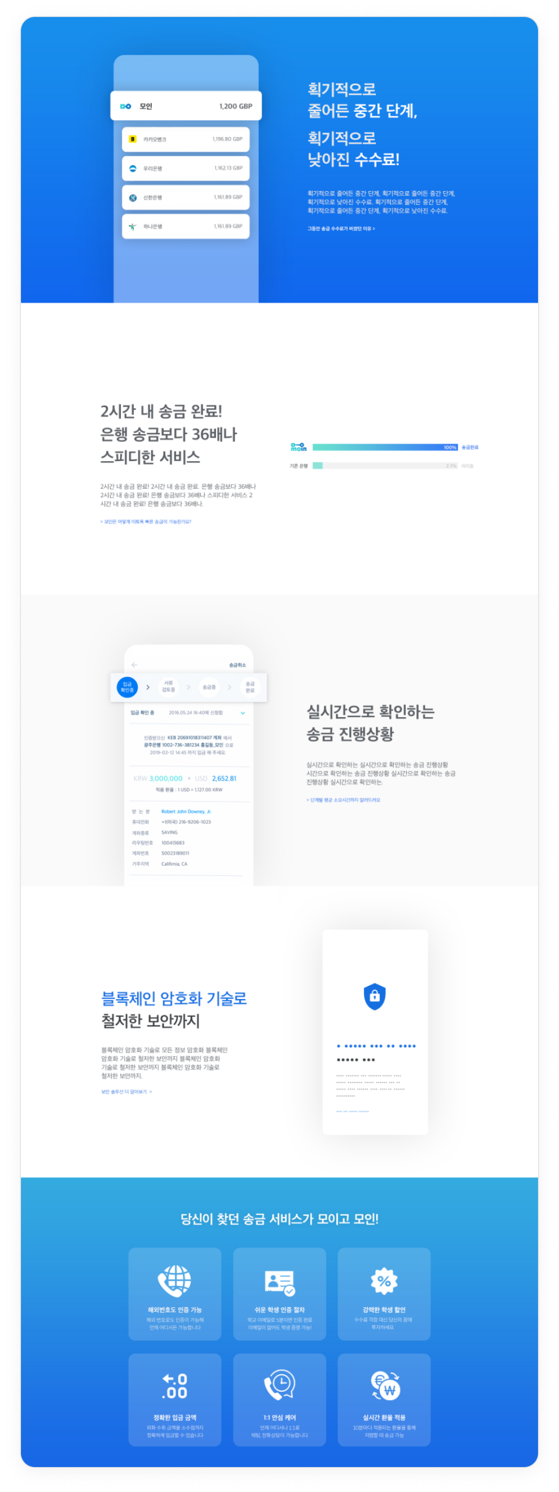
  • Put one message on one screen so that viewers can catch it even when they quickly scroll through the landing page.
  • Keep a consistent visual style.
01-1
STRONG FIRST IMPRESSION
As is
  • Missing selling point
  • Confusing menu
  • Ineffective CTAs
To be
  • Clear selling point
  • Clear service preview
  • Clear menu composition and CTAs
01-2
STRONG STATEMENTS
As is
  • High cognitive load
  • Too much information in one screen
  • Weak visual hierarchy
To be
  • Low cognitive load
  • One message on one screen
  • Strong visual hierarchy
01-3
CONSISTANT VISUAL STYLE

02

PROVIDE A COMPELLING CTA

Out of five CTAs on the landing page, only one led to the registration which is the conversion goal. The rest of the CTAs mislead users to various pages and disrupt users to register. Current app store CTAs can trigger a high bounce rate on non-mobile devices.

To solve the problem,

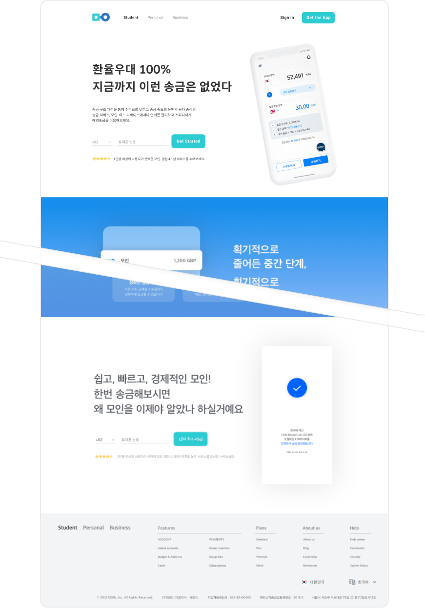
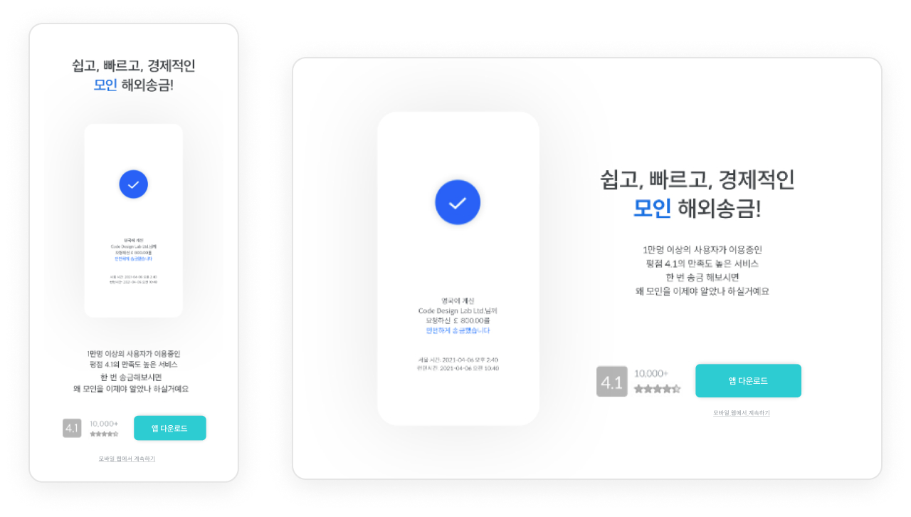
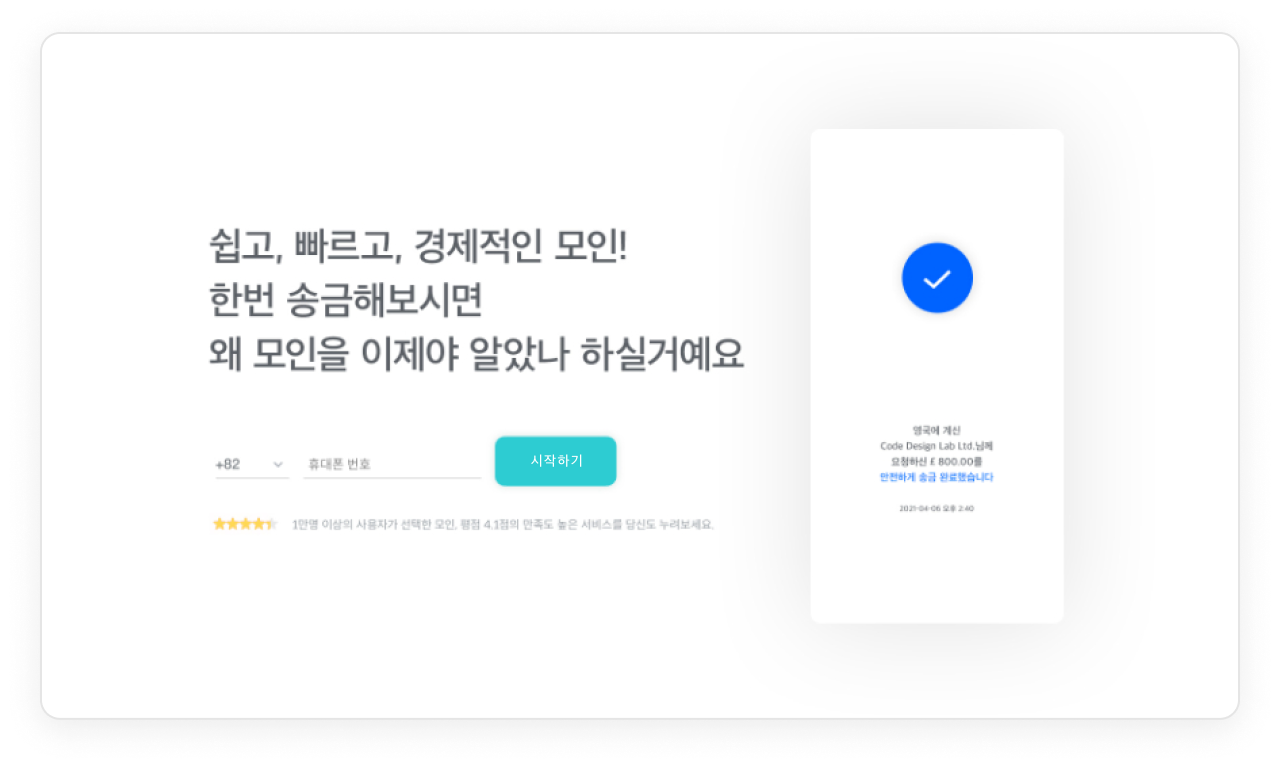
  • Every CTA is designed to be compatible with each viewer’s device. For example, CTA on the desktop page sends app download links directly to the user’s mobile device, instead of opening an app store page which is unnecessary on desktops.
  • The peak-end rule is applied by placing CTAs at the beginning and at the end of the page to emphasize them.
  • Every CTA is linked directly to the conversion goal and has consistent button color.
02-1
MAKE CTA WORK
As is
  • Lack consistency
  • Disconnected from the conversion goal
  • Ignore the viewer’s device
To be
  • Relevant to the viewer’s device
  • Repeat CTAs at the end of the page
  • Direct to the conversion goal

03

MAKE IT RESPONSIVE

Adapting the experience for each context of use on a landing page is critical for a service because it is directly related to the bounce and conversion rate. Especially, responsive design is a must when more than half of viewers use mobile devices and the mobile share is predicted to increase. (source: market.dighty.com)

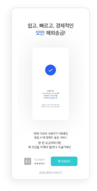
To make it responsively for desktops, tablets, smartphones, and almost any other device,

  • Every CTA is designed to be compatible and every element is designed to be legible, clickable, and tappable.
  • The grid system keeps the site visually organized and appealing.
03-1
CTAs ON MOBILE
  • Opens either Google Play Store or App Store
  • Mobile web access is available
  • Tappable buttons
03-2
CTAs ON DESKTOP
  • Sends a download link to the user’s mobile device
  • Start a sign-up process simultaneously
03-3
GRID SYSTEM

WHAT I LEARNED
& NEXT STEPS

WHAT I LEARNED

From this case study, I was able to develop a more user-centered landing page for a startup to adapt the experience for each context of use on a landing page to enhance the bounce and conversion rate. 

  • The landing page should deliver a clear message to the visitors.
  • Less is more. If the goal is clear, keep content simple and strong and funnel the users towards CTA.
  • Responsive design should be optimized for various types of devices for higher a conversion rate.
NEXT STEPS

For the future direction, it would be nice to add more micro-interactions and design dark mode to keep viewers interested.

Also, I kept it focused on minimizing overall content but I’d like to explore effective ways to mix in social proof on the landing page.